Problem
The automotive category is saturated with literal visuals—cars, wheels, and aggressive speed cues that feel repetitive and predictable. While familiar, they fail to differentiate or communicate strategic expertise. AutoCapt needed a sharper identity—one that signals control, precision, and forward movement without relying on obvious industry symbols. The challenge was to stand apart while still feeling credible and performance-driven.
Solution
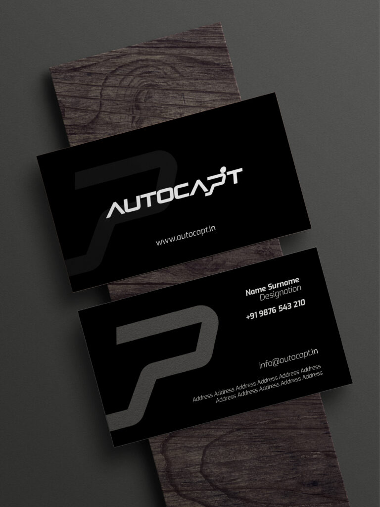
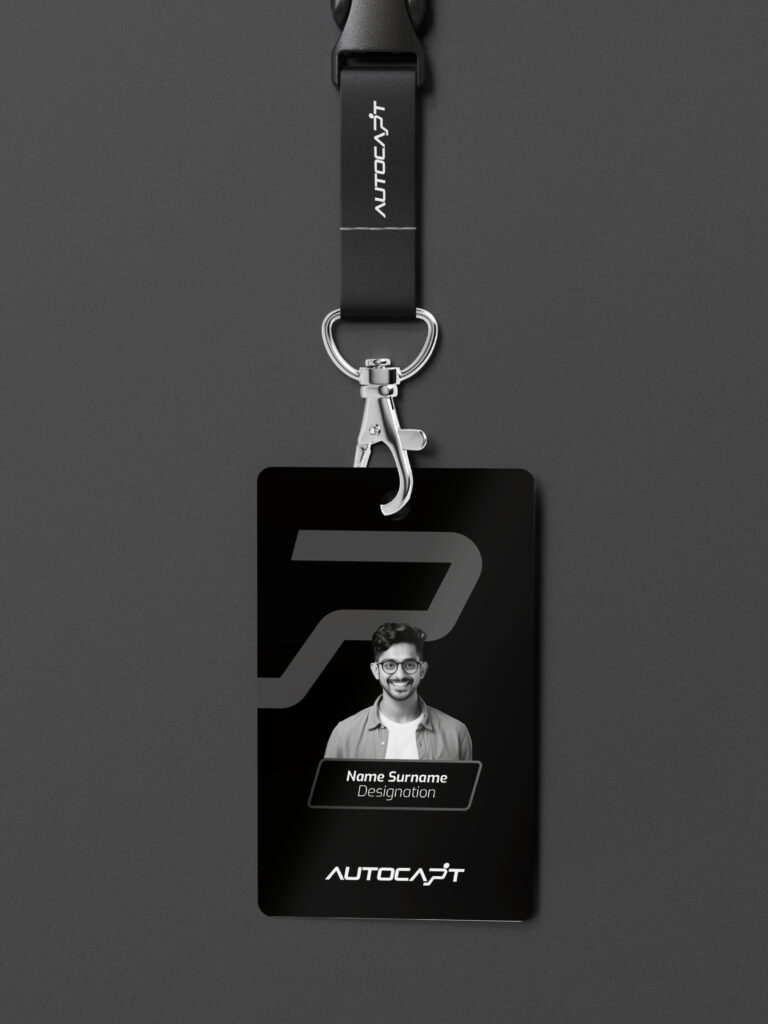
We built the identity around abstraction and intent. The core mark suggests a driver in motion—reduced to a minimal, directional form that communicates control without imitation. This was paired with a custom, forward-leaning wordmark to reinforce speed and progression. The visual system extends through bold, high-contrast applications and structured layouts, creating a consistent language of movement, discipline, and clarity across every touchpoint.
Result
The identity positions AutoCapt with a distinct, confident presence in a crowded market. By removing visual clichés, the brand becomes more focused, more recognizable, and more aligned with its strategic role. It doesn’t just represent the automotive space—it reflects leadership within it, communicating precision, control, and forward momentum at every interaction.