Problem
The maternity healthcare space is heavily saturated with predictable, clinical branding—dominated by pastel tones and environments that often feel sterile and impersonal. This creates a disconnect between what patients emotionally need during such a sensitive life stage and what hospitals actually communicate through their brand. Cradle Wood required a distinct identity that could break away from these conventions, build immediate emotional trust, and create a sense of warmth, safety, and reassurance from the very first interaction.
Solution
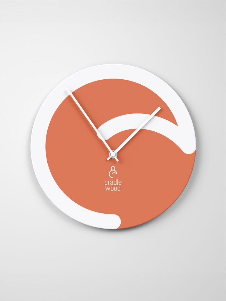
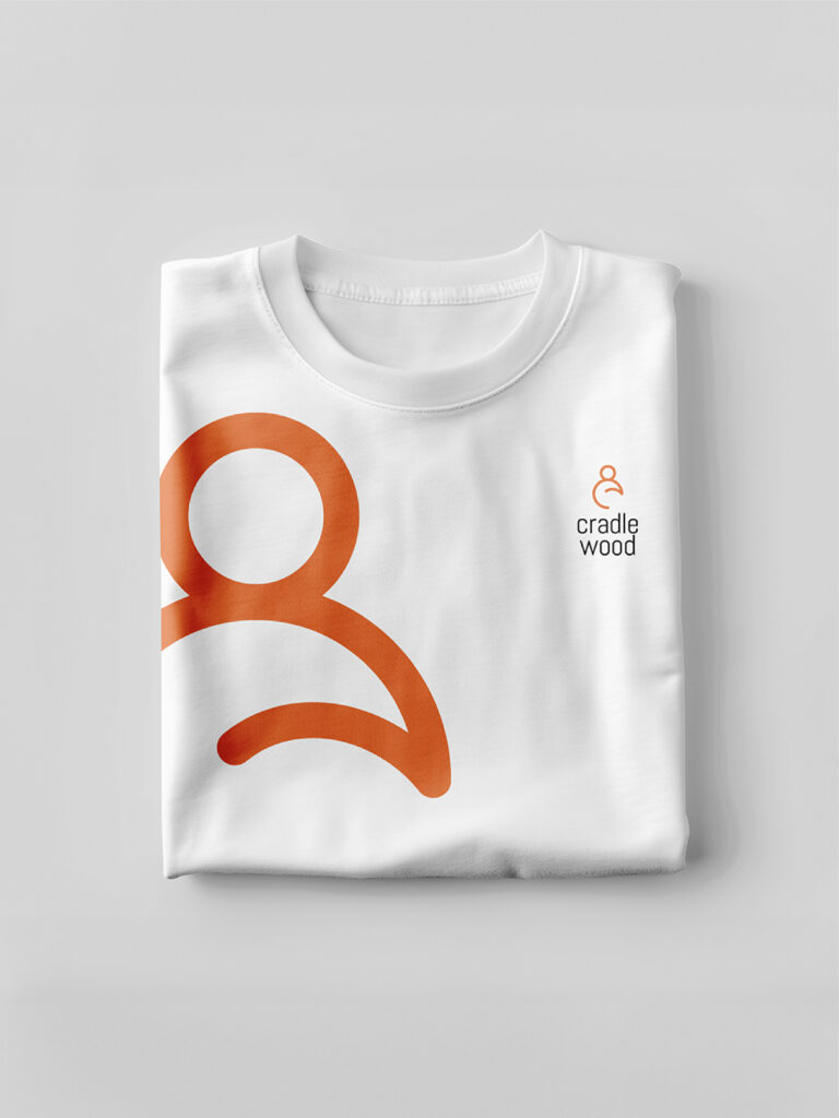
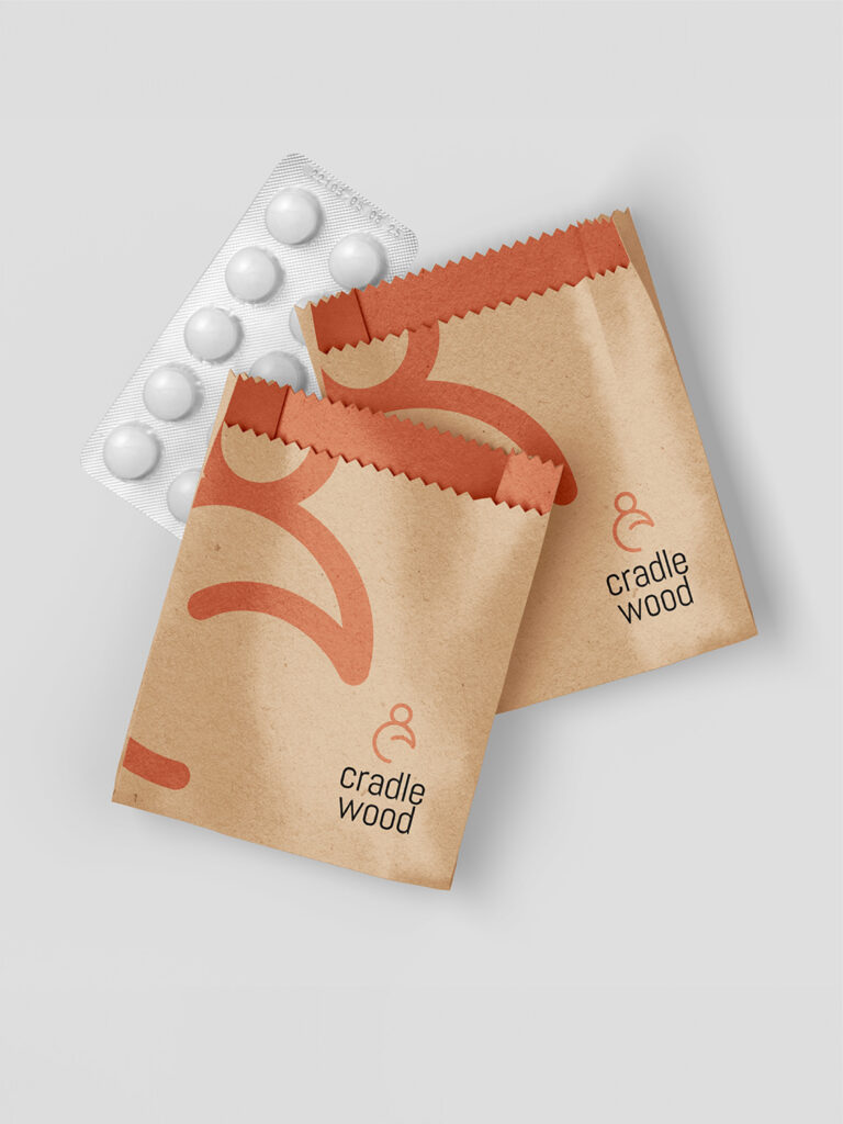
We repositioned Cradle Wood from a traditional healthcare provider to an emotion-led care experience. The visual identity was built around a minimal, fluid symbol representing both mother and child, conveying protection, nurturing, and continuity. Instead of relying on overused category colors, we introduced a warm, earthy palette to evoke comfort and positivity. This system was consistently extended across all touchpoints—including uniforms, packaging, and environmental branding—ensuring every interaction felt calm, human, and welcoming rather than clinical.
Result
The new brand identity significantly shifted both perception and engagement. Patients experienced a stronger emotional connection with the space, while the brand stood out clearly in a crowded market. The hospital saw an increase in walk-ins and inquiries, along with a noticeable elevation in how the brand was perceived—from a standard medical facility to a comfort-driven care environment. As the client described it, “the brand feels like a hug.”