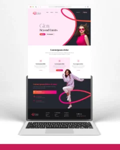
Problem
Luxury salon branding often relies on predictable cues—ornamental logos, decorative typography, and visuals that feel familiar but lack distinction. This creates a space where many brands look refined, yet few feel memorable. NAYALO needed an identity that could express movement, care, and transformation in a more contemporary and scalable way—while still maintaining a premium presence across both service and product touchpoints.
Solution
We developed an identity system rooted in motion and structure. The symbol was built by combining three core ideas—flowing hair movement, the intricacy of braids, and an upward sense of progression. These elements were distilled into a minimal, fluid form that feels both expressive and controlled. The overall system balances softness with precision, allowing the brand to feel refined while remaining adaptable across packaging, space, and digital applications.
Result
The final identity gives NAYALO a more distinctive and future-ready presence within the luxury salon space. It moves beyond decorative aesthetics and establishes a clearer visual language built on form and meaning. The brand now feels more cohesive, scalable, and premium—capable of extending seamlessly from salon experience to product branding while maintaining a strong, recognizable identity.